
OVERVIEW
Scotiabank has been undergoing a complete transformation of its retail web banking platform. A significant challenge in this journey was redesigning the retail investment experience which had many problems that had manifested over the years. At first, the main goal was to modernize the experience with Scotiabank's new design system, however, through research and usability testing, this evolved to flattening the IA to unify fragmented experiences, and putting an emphasis on guidance and education.
My role
Product Designer
Platforms
Desktop web
Mobile web
Timeline
2023/2024 (8 months)
PROBLEM
MODERNIZE THE EXPERIENCE
The product and business lines main objective for this project was to build all investment functionality in the new retail banking web platform as the old platform was dated and out of touch with modern website design. This meant modernizing everything from the backend systems, to the interface, using our new design system.

INCREASED CLIENT ENGAGEMENT
At the outset of the project, the only success metric was to allow clients on our new web platform to start using retail investment functions, therefore increasing client engagement.

CONSTRAINTS
TIMING IMPACTING APPROACH
This was the final feature needed to achieve feature parity with the existing web platform. We adopted a design-led research approach rather than conducting exploratory interviews. Our designs were based on current standards and focused on addressing problems in the existing experience. We then validated these designs through usability testing.
UNDERSTANDING INVESTMENTS
Many people find investments complex and difficult to understand. When designing different scenarios, we needed to consider various rules affecting legal copy, contribution limits, and KYC verifications. Our challenge was to ensure compliance with these requirements while presenting information to clients in a clear, digestible way.

DISCOVERY


KEY INSIGHT
EARLY COMMUNICATION WITH ENGINEERING
We identified numerous validation checks required for customer eligibility. If these checks had been overlooked, they could have caused significant development delays and customer frustration. By surfacing them early, we ensured they were accounted for in the development timeline, avoiding costly rework.
I used this idea to guide me throughout the entire project and to communicate the story to stakeholders that we don’t need to fragment the experience for investments. In our old platform, we isolated the investment experience, making clients learn two ways for transferring between their retail accounts and investments, causing confusion. With the hypothesis that clients mental model for investments and retail accounts was the same, a new goal of this project was to unify the experience, making simpler and more intuitive for clients.
UNIFY THE EXPERIENCE
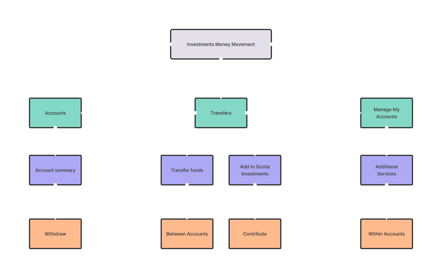
The investment experience on our old platform was fragmented, with features like transfers, contributions, and withdrawals scattered across different sections of the platform. I decided this would not align with todays clients mental models, so we decided that a new goal of this project was to rethink the information architecture so clients can find investment features more easily and in the context of their tasks. This meant flattening our current information architecture.
INCREASED FLOW COMPLETION
By flattening the information architecture of the investments experience, clients would be able to find and complete flows more easily.

IDEATION & TESTING
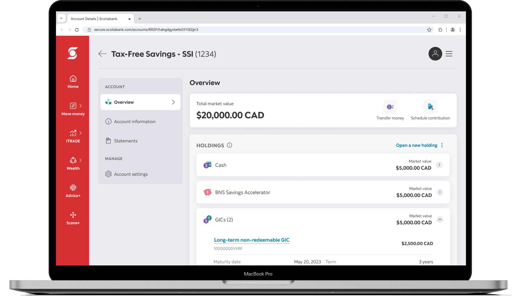
ACCOUNT DETAILS
New Design System – The CANVAS design system would lay the foundation for the new investment account details. This would ensure consistency across the platform and make it easier for engineering partners given the tight timelines.
Clear Actions – The current account details page did not display clear actions for users to withdraw or transfer money. We wanted to make sure these actions were clear so that we could increase clients online engagement and task completion rates.


MONEY MOVEMENT FLOWS
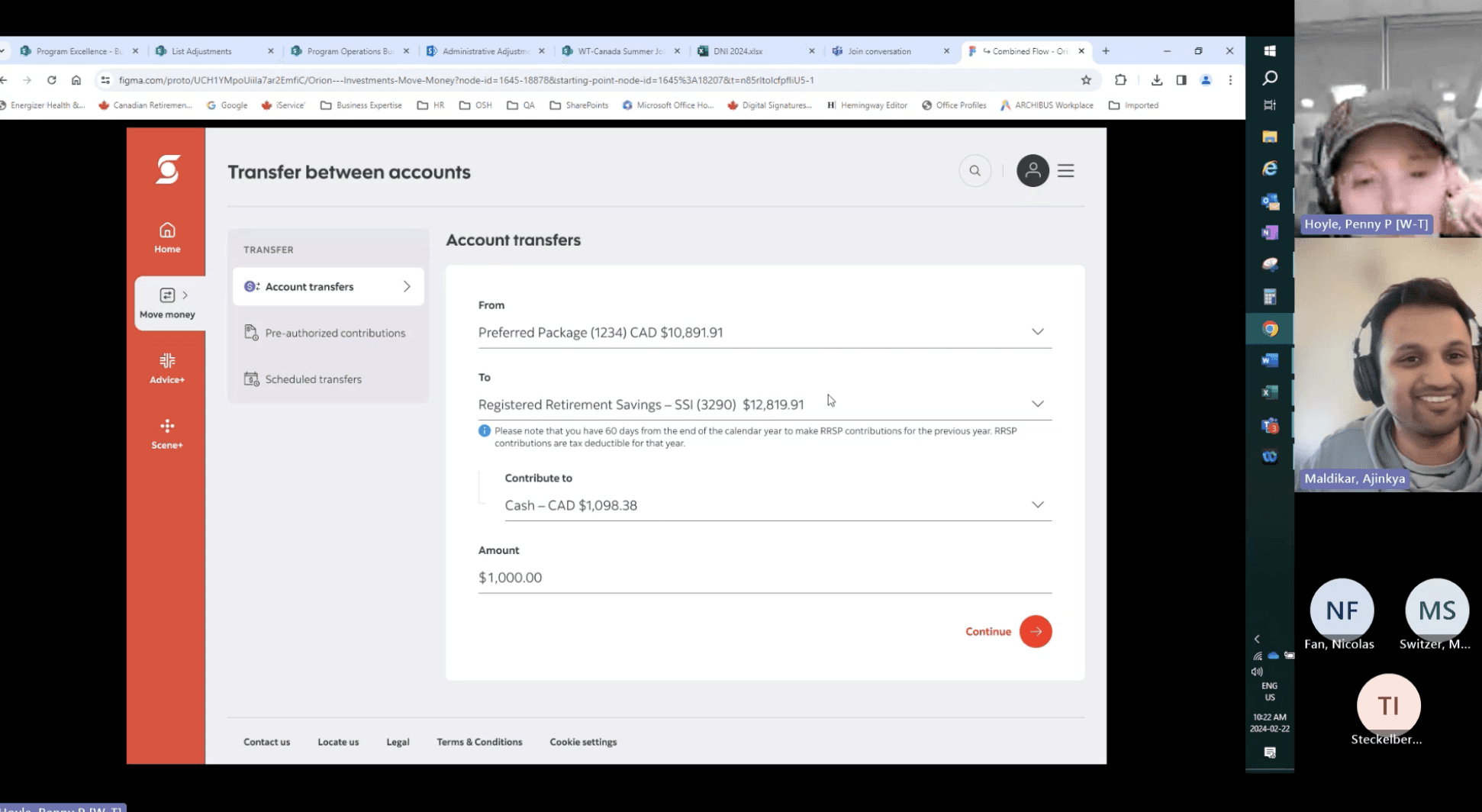
The hypothesis was that clients wanted to move their investment funds in the same way that they would for chequing, savings, and credit card accounts. Therefore, we flattened the IA and consolidated all move money actions including contribution, withdrawals, and transfers into one single form. From this for, clients could select their accounts and move funds anywhere, without having to triage themself into doing a specific action first.

KEY INSIGHTS
INVESTMENT ACCOUNT DETAILS
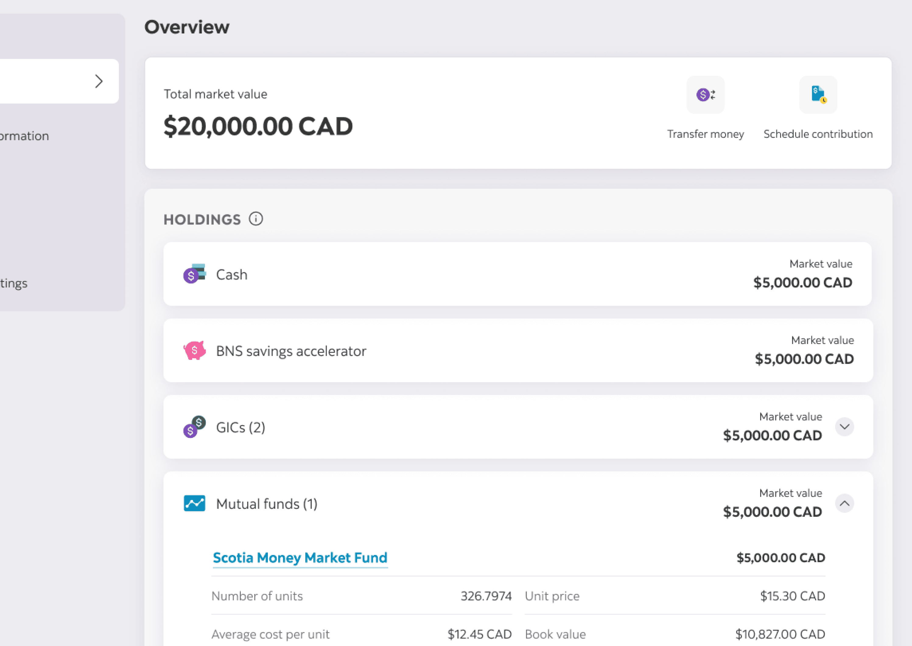
✅ Overall, most users found the information listed within the investing accounts quite straightforward and easy to grasp. There was positive feedback about the shortcuts and their perceived utility and all users reacted positively to the UI of the page.
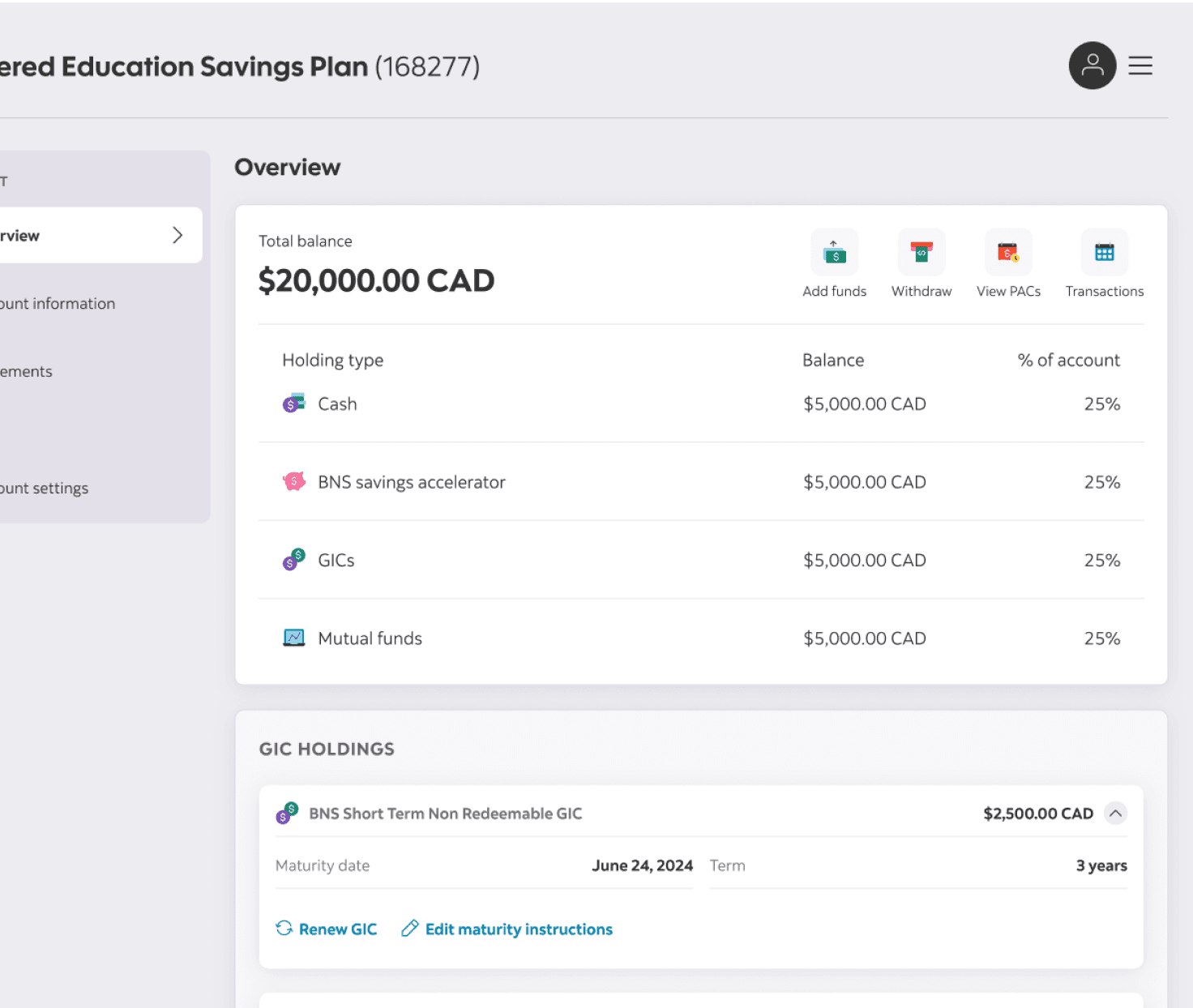
❌ There was some confusion in grasping that the GIC holdings and Mutual funds funds summary in the cards was the same as the GIC and mutual funds listed in the holding cards.
"I'm not sure why I am seeing GIC and mutual funds twice? Are these the same account?" – Male, 42
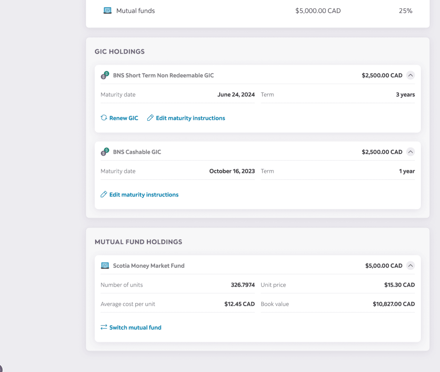
❌ Participants also expressed a concern about the holdings themselves since some had their investment accounts set up by financial advisors. They did not know the difference between holding their money in cash versus savings accelerators, GICs, and mutual funds. This was worrisome as it represented a true lack of financial literacy when it came to their investments.
"I'm not sure what the difference between Cash, GICs, and mutual funds are. Currently, I believe my TFSA is all in Cash and I think that earns me good interest"
– Female, 30
MONEY MOVEMENT FLOWS
✅ Our hypothesis that clients wanted to move their investment funds in the same way that they would for chequing, savings, and credit card accounts was correct as participants expressed that completing different tasks in the same form aligned with their mental models.
✅ Overall, clients felt that the flow was easy to use, entry points were clear and even those who struggled at moments found it to be intuitive after just one use.
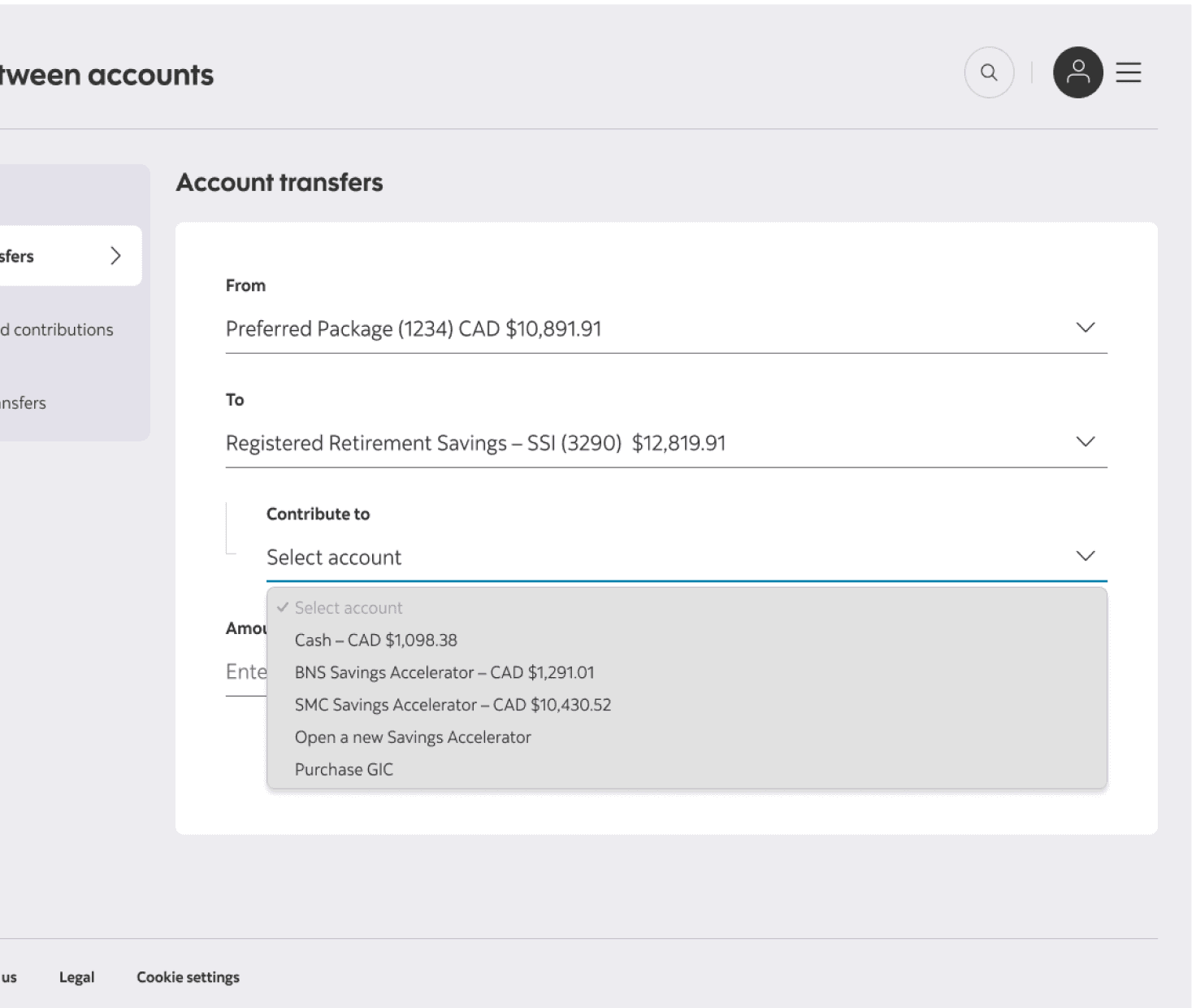
❌ The responses to in-flow options to purchase investments was lacklustre. Participants claimed that they would likely not utlize these entry points here as these are decisions they usually make with advisors. They felt this would not be the right time for them to make decisions like that given the lack of context.
"I'm not sure how likely I am to Open a Savings Accelerator or Purchase a GIC at this point in the flow. I would need more information since I don't usually make these decisions" – Female, 30
EDUCATE ABOUT INVESTMENTS
How can we effectively educate customers on the structure of their investment accounts to help them understand their finances better and put them in a position to make better financial decisions?
What information do clients need and at what points do they need them in order to feel they can make an informed decision?
How can we strategically place entry points to meet customers where they feel they can make important decisions?
DECREASE IN CALL VOLUME TO CALL CENTRES
By giving clients valuable information when they need it to make financial decisions, we hoped to reduce call volumes to financial advisors, branches, and call centres, as it related to investment functions.

OUTCOMES
GOALS → SOLUTIONS
The goal at the outset of the project did not turn out to be the only goal that needed to be solved. Along the way, new discoveries were made whether it be through usability testing or coming up with a hypothesis.
DATED → MODERN
The backbone of Scotiabank's new web experience is the Canvas Design System. Leveraging this design system held even more importance to this project for a couple reasons:
(1) Ensure visual and functional consistency – By using Canvas components, we aligned the investment experience with the broader retail banking platform, creating a more familiar and seamless interaction for clients.
(2) Reduce engineering lift – Instead of designing custom UI elements that required additional development effort, we worked closely with engineering to reuse and adapt existing components. This helped us meet our deadlines without compromising quality.
(3) Improve scalability & accessibility – Canvas was built with accessibility in mind, ensuring our redesign met WCAG standards from the start. This meant we didn’t need to retroactively fix accessibility issues, saving time and effort.


FRAGMENTED → UNIFIED
The original investment experience was fragmented, with features like transfers, contributions, and withdrawals scattered across different sections of the platform. Clients struggled to find what they needed, leading to confusion and unnecessary friction.
To address this, we redesigned the information architecture (IA) to create a unified, task-based structure, mirroring the way people manage their everyday banking. By consolidating investment actions into a single, streamlined flow, we reduced cognitive load, improved discoverability, and made it easier for clients to complete tasks with confidence. This shift not only enhanced usability but also aligned investments with the broader banking experience, reinforcing a sense of familiarity and ease.


LACK OF EDUCATION → CONTEXTUAL GUIDANCE
Many clients struggled to understand investment accounts, leading to hesitation and reliance on financial advisors.
To bridge this gap, we introduced contextual guidance at key decision points, ensuring that the right information appeared when clients needed it most. Rather than overwhelming users with dense explanations upfront, we embedded progressive disclosure—offering tooltips, inline prompts, and expandable help sections that clarified terms, contribution limits, and tax implications in the moment. This approach empowered clients to make informed decisions independently, reducing frustration and increasing confidence in managing their investments.


DISCONNECTED → SEAMLESS
Previously, investment money movement flows were buried in separate sections, requiring clients to navigate away from their account details to take action.
To create a more seamless experience, I designed in-context entry points that allowed users to move money directly from their investment account view. If a client had cash sitting idle in their account, they could easily transfer it into an interest-earning investment with just a few clicks. By surfacing these opportunities at the right moments, we not only streamlined workflows but also encouraged smarter financial decisions, helping clients maximize their investment potential without unnecessary friction.


DATA & IMPACT
SUCCESS MEASURES
The redesign of the investment account experience successfully modernized a previously outdated platform, unlocking access to new functionality and significantly improving client engagement.
+2M
NEW ENGAGEMENT OPPORTUNITIES
By giving clients access to investment activities—such as contributions, withdrawals, and pre-authorized setups—on the new platform, we expanded access to key investment flows. This resulted in over 2 million new clients engaging with their investments.
+3.5%
INCREASE IN FLOW COMPLETION
WHAT'S NEXT?
To further validate and measure ongoing improvements, we plan to implement a robust tracking strategy that includes:
Improved Self-Directed Usage: While we are still in the process of measuring the full impact on call centre volume, usability testing revealed that participants were able to independently navigate and complete tasks that previously required financial advisor support. This suggests a shift toward increased self-service and digital autonomy.
Interaction Tracking: Monitoring clicks and drop-offs on key actions like “Contribute,” “Withdraw,” and “Set up PAC” to identify where users succeed or struggle.
Conversion Funnel Analysis: Measuring start-to-finish completion rates for investment flows to pinpoint bottlenecks or UX gaps.
Engagement Heatmaps: Understanding which elements of the investment summary and details pages are most frequently interacted with.
Search and Navigation Logs: Tracking how users locate entry points to investment actions to optimize information architecture.
Together, these changes lay the foundation for a more modern, accessible, and engaging investment experience—designed to empower clients and reduce friction in managing their portfolios digitally.
